
I designed and built a new writing portfolio!
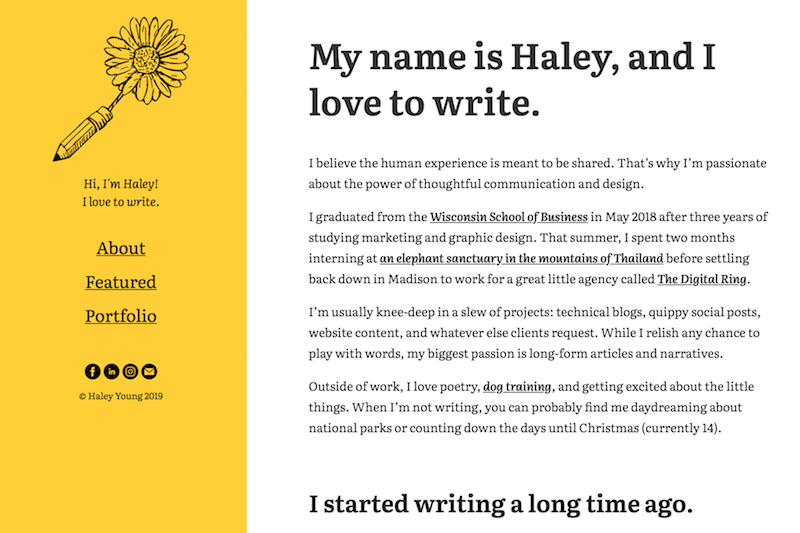
A screenshot of my new writing portfolio, a custom WordPress theme I designed and developed
Sometime back in early summer, I decided I needed a new writing portfolio.
I then decided I should change website hosts, get rid of everything I previously had up online, and start completely fresh with a site that was, you know, “more me”. (Let’s just ignore the fact that some days I don’t even know who “me” is).
It was a wonderful glorious happy crazy fun idea. It was also a ton of work.
But here we are, folks.
Hours of writing, designing, and coding (read: procrastinating, doubting, and hair-pulling) later, you’re staring deep into the eyes of my latest creative pursuit. Cheers!
I’ve gotta admit it: I’m pretty proud.
Proud enough to take a deep-dive into what the entire process was like, so *drumroll*…
Why did I decide I needed a new portfolio?
This whole thing started when I realized that my existing portfolio website was at best messy, and at worst a horrible reflection of who I am and what I do.
It was a pared-down version of the website I used to promote myself during college that screamed “hire me” and “I have no idea what I’m really looking for in a career”.
There were two main problems there.
I’m not looking for a new job
I love my position at The Digital Ring, and though I was interested in showcasing more of my work online, I was not interested in looking like I was desperately seeking a novel 9-5.
I actually do know what I want in a career
Over the past year and a couple months in the “real world”, I’ve come to understand that one of my passions truly stands above the rest: writing.
I like designing, I like coding, I don’t mind managing projects… but I love using the power of language to connect with other people.
So it all seemed quite straightforward. I needed a new portfolio, and it needed to accurately reflect my interests.
I made a decision: I’d merge my “professional portfolio” and then-separate “personal writing portfolio” into one.
And it would be totally badass.
How did this whole design and development process happen?
All of this brainstorming was fine and dandy. In fact, it was really, really fun. I fondly remember one Sunday afternoon in particular when my boyfriend and I went to a local brewery, ordered a flight, and covered notebook sheet after notebook sheet with ideas.
The actual execution, though, wasn’t quite so simple.
Let’s switch website hosts
First, I ended up switching website hosts. I’d gotten my original domain and hosting when I was in the 7th grade back in 2009, and my chosen company hadn’t done much to grow with the times.
The switch to Bluehost was a wee bit messy, but thanks to one of the awesome developers at my day job (S/O, Nate!) we kept the drama to a minimum.
Organization can’t be too complicated, right?
Then I spent several months overthinking how my new site would be organized.
Moving on from the past
In the past, I had separated my “personal” work from my professional persona, opting to have two separate websites. My “from the heart” writing lived on clompish.com (my first-ever domain named after an old stuffed dinosaur), while my resume and “more polished” work resided at haleyeyoung.com (‘cause you know, it’s the 21st century and we all need to have websites named after ourselves).
For a time, this at least sort of made sense. I saw language as more of a hobby than anything else and didn’t realize I wanted to — or even could — write for a career.
Having these disparate online homes allowed me to share my writing when I wanted and still keep my professional opportunities open.
But I wanted that to shift.
Showcasing all my writing
Since I started at The Digital Ring, most of my work has been centered around content creation. I even moved into an official Content Specialist role this fall — cue major excitement!
These (awesome) things meant I needed to figure out how to display client work and “personal passion project” work all in one place.
So I went back and forth between ideas, crossed things out, and rewrote them over again… I won’t bore you with the details, but suffice to say the process was far from linear.
I finally settled on a seemingly sensical structure though. My site would be simple, featuring:
- An “about me” page (the homepage)
- A “featured work” section highlighting pieces that make me especially proud
- A portfolio divided up by both type of writing (blog, poetry, etc.) as well as writing topic (dog ownership, personal growth, etc.) to allow each visitor to easily find what they think is most important
Figuring out exactly how the pages would display this information was another battle entirely, but, you know.
At least I’d made it this far.
To dev or not to dev, that is the question
Once I had a good idea of the organization, I had to make a decision.
I knew I wanted my website on WordPress. But did I want to:
- Pay for a premium theme and not bother with design and development myself
- Use a premade theme as a parent and adjust to my liking
- Or start completely from scratch?
A glutton for punishment (and craving, I suppose, a nice challenge), I decided on the latter.
I’m still not sure if it was the technically “best” decision, but I’m happy.
I do have a minor in graphic design…
Figuring out the visual aesthetic of my new portfolio was equal parts headache and joy.
I studied graphic design alongside marketing in college, but I don’t regularly put those skills to use at work (we leave that to the in-house pros).
Going in, I knew three things:
- I wanted my website to make use of my favorite color: yellow
- I didn’t want my portfolio to “look like every other site on the web”
- I would prioritize color contrast to make my site as accessible as possible
How’d I do? 😉
The design process didn’t take quite as long as figuring out my new portfolio site’s organization, but it was still a hefty task.
I made literally hundreds of sketches, changed my logo direction no less than four times, and spent way too long debating the finer points of italicized type.
After scouring the Webby awards and picking the brains of my friends and family for inspiration, I finally came up with something I liked.
A bright yellow sidebar is admittedly a bit obnoxious, but I felt like it met my original criteria!
My sketched logo
My pencil-flower logo is an idea I’ve tossed around for a while. The sketched appearance seemed like an appropriate choice given how much of this process had taken place with an actual pen and paper.
It took me a bit by surprise, actually — I’m usually fond of flat, clean design, so embracing a logo with some “messy” lines was kind of a big deal for me.
A difficult navigation process
The part I struggled with the most was the navigation. At one point, I had 20 some designs laid out side-by-side in an Illustrator document for comparison, and I still couldn’t make a decision.
No matter what I did, I felt like the buttons either seemed too boring or way too involved — that elusive “happy medium” remained far out of reach.
I finally settled on what you see before you.
I’m pretty pleased, but I’ll still happily take bets on how long I can go before I feel the craving to experiment with something new. 😉
When did website development get so hard?
I won’t sugarcoat it: I bit off more than I could chew when I started my new portfolio’s development. My eyes were bigger than my stomach. I fell prey to the Dunning-Kruger effect.
However you phrase it, I wasn’t quite ready for everything it would take to execute my vision.
Feeling prepared to dev
Some things, at least, were pretty simple.
I first started developing websites in the 5th grade. I taught myself basic HTML and CSS to edit my Neopets’ petpages (embarrassing but true story).
Over the years I kept experimenting, and I even spent my first two years of college believing I’d be a front-end developer when I graduated. I took multiple online courses on Treehouse and held several web development internships and jobs while in school.
So the basics weren’t too hard. I have a good grasp of HTML and CSS, and I frequently make small code changes while uploading website copy and blogs at my day job.
Setting up a website’s structural framework and adding a few design touches? No problem. I’d even developed a few WordPress themes in the past, so I wasn’t too intimidated by the loop and basic template files.
I’d also been learning a ton about SEO for work, and I felt like I understood most of the technical and qualitative best practices without much issue.
I didn’t want to do it the “same old way”
The real struggle started when I decided to try lots of new things. I wanted to use Sass, and I was enamored by CSS Grid.
Most saliently, I wanted some animation on my new site — and I never really had gotten the hang of JavaScript (even back in my “I want to be a developer” days).
Thanks to Google searches (bless you, internet) and some awesome developers I’m lucky enough to know in real life, I managed to at least sort of pull it off. Take a look at the mobile navigation sidebar flyout!
Challenges are pretty fun
Long story short medium: developing this new portfolio was a challenge. Sometimes I really, really regretted the decision to build it all from scratch.
Now that it’s finished, though, I couldn’t imagine doing it any other way.
It’s far from perfect, and I hope to continue refining my code as time goes on. But sticking to my guns and learning so many new things? That definitely makes my list of “biggest 2019 accomplishments”.
What now?
What comes next, now that I have a “polished” online home to display my work?
The answer is simple: I write.
As exciting as it was to tackle this project from start to finish — and as proud as I am of the tenacity I honed — I’m ready to settle in and focus on what I really love.
Like what you're reading? Learn more about me or check out my featured work.